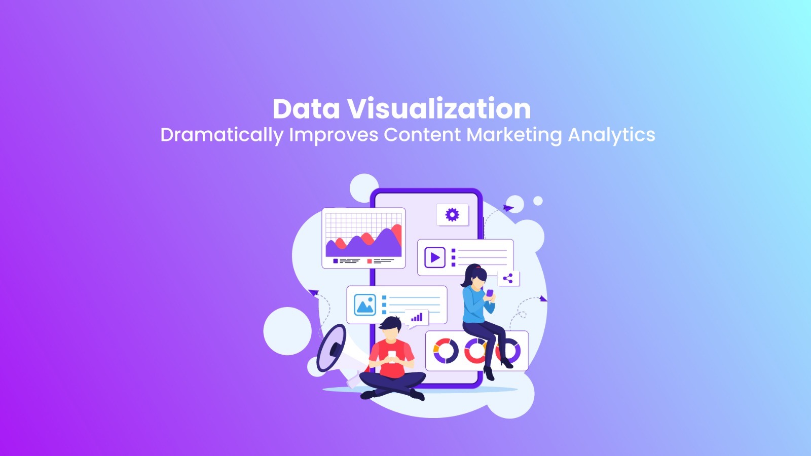
Data Visualization Dramatically Improves Content Marketing Analytics
Introduction
Digital marketing being the focus of the present time, companies depend on data to fuel their content campaigns. Unprocessed data won’t do. If data is presented in an undigested, hard-to-make-out format, then the figures can easily become useless information instead. Data visualization bridges the gap between intimidating figures and meaningful information. Proper application of content marketing analytics allows organizations to mature their campaigns to improve strategy and increased engagement, conversion, and ROI.
The Function of Data Visualization in Content Marketing
Data marketing drives content marketing today. Marketers monitor performance metrics like website traffic, social media engagement, conversion rates, and customer interactions. But looking at spreadsheets and what looks like an endless line of reports is draining. Data visualization distills this into charts, graphs, and interactive dashboards so that it is simple to interpret trends and patterns.
Advantages of Data Visualization in Marketing Analytics
Eases Understanding of Data: Unmeasured data is hard to comprehend. Data visualization eases understanding so that marketers can easily comprehend crucial insights and make effective decisions.
Improves Content Strategy: Measurement of performance through content enables marketers to comprehend what works and modify content strategy accordingly.
- Boosts Engagement & Conversions: Mapping user behavior enables marketers to build improved content that will result in greater engagement and conversions.
- Improves real-time decision-making: Interactive dashboards render data in real time, and marketers can make real-time adjustments.
- Pinpoints Trends & Opportunities: Plotting past data against time displays trends, seasonality, and opportunities for expansion.
How to Track Content Performance with Data Analytics
Content performance revolves around tracking some of the most significant performance metrics (KPIs). Some of the metrics to enhance marketing intelligence through data visualization include:
Identifying the Key Metrics
In order to track success, marketers initially have to identify the right KPIs, which are:
Website Traffic: Page views, sessions, bounce rates.
- Engagement Metrics: Likes, shares, comments, time on page.
- Conversion Rates: Sign-ups, purchases, downloads.
- SEO Performance: Keyword ranking, backlinks, domain authority.
- Customer Retention: Repeat visits, churn, lifetime value.
Optimizing Real-Time Decision-Making
Tools such as Google Data Studio, Tableau, and Power BI are some of the advanced-level analytical classes available for marketers to utilize. They are simply collations of various channels’ data and give the overall picture of the result for marketing.
Simplifying Complex Data
Comparison of performance metrics over time enables marketers to know seasonality trends and success rates of different content. Line graphs, heatmaps, and comparative bar charts are ideal for this.
Analysis of audience behavior
It is a type of visualization that explains how real users behave when interacting with content.
- Heat maps: Show where people click and scroll the most.
- User flow diagrams show where people browse around on a site.
- Geographical maps: Show where the potential audience resides.
Production Optimization Based on Insight
Changes can be made based on what marketing analytics tell you.
For example:
- If video content is more popular, make more videos.
- If blog posts about a specific topic are most watched, make more of those blogs.
- If social media is uninteresting, why not present it differently or at another time?
Data visualization to enable easier understanding of marketing is a continuous activity this week
Performance measurement of social media
As a high-performing vehicle for content marketing, with tracking and monitoring, visualization enables one to find out their performance. Some of the most important metrics to monitor can include:
- Engagement metrics—likes, comments, shares, impressions.
- Top-performing posts—to know how various posts engage differently.
- Follower growth patterns—how your audience is growing.
SEO & Organic Traffic Tracking
For search engine optimization brands, marketing analytics dashboards are:
- Keyword Rankings Over Time: Line graph of progress improvement.
- Traffic Sources: Organics vs. paid and referrers in pie chart.
- Backlink Analysis: A presentation demonstrating an escalation of domain authority in the form of a graph.
Email Marketing Metrics
Visualization of data, where it is a result of the email marketing campaign, makes the latter the most effective. It draws critical scrutiny to the below aspects:
- Open Rates and Click Through Rates: Percentage charts.
- Conversion Funnels: User journey to buy through email click through.
- A/B Testing Results: Side-by-side visuals of subject line, form, and power of CTAs.
Paid Advertising Performance
Competing content marketing ads on channels like Google Ads and Meta Ads need to be optimized every time. Data visualization solutions can:
- Track CTR, CPA, and ROAS.
- Visualize the comparison of campaigns by performance.
- Review this audience with the intention of targeting optimization.
Conclusion
Data visualization converts marketing analytics to a significant extent. From tapping raw data to visual understanding, marketers can improve content strategy in an effort to further optimize campaigns and bring about improved performance in the end. With stiffening competition in internet marketing, intimidation by data for strategic know-how will put competition ideas trending at the top of business.
Businesses today are looking to improve marketing performance by investing in the right data visualization software. At RealVibe Digital Media, we turn information into actionable strategies that translate into brand growth.